Installation Steps
We recommend to Install the Extension via Composer. For manual installation, please find the mentioned steps below:
Step 1: Upload all folders from the extension package to the installation directory of your Magento software using an FTP client.
Step 2: Now you need to install the html2Pdf and php-sasslibraries using following commands:
composer require spipu/html2Pdf
composer require panique/php-sass
COMPOSER FILE:
{
    "name": "PrintXpand/productdesigner",
    "description": "Web to print solution",
    "require": {
        "php": "~7.0.0|~7.1.0|~7.2.0",
        "spipu/html2Pdf":"*",
     },
    "type": "magento2-module",
    "version": "2.0.0",
    "license": [
        "OSL-3.0",
        "AFL-3.0"
    ],
    "autoload": {
        "files": [ "registration.php" ],
        "psr-4": {
            "PrintXpand\Productdesigner\": ""
        }
    }
}
COMPOSER FILE THEME COLORS ADDON:
{
    "name": "PrintXpand/themecolors",
    "description": "Web to print solution",
    "require": {
        "php": "~7.0.0|~7.1.0|~7.2.0",
        "panique/php-sass":"*"
     },
    "type": "magento2-module",
    "version": "2.0.0",
    "license": [
        "OSL-3.0",
        "AFL-3.0"
    ],
    "autoload": {
        "files": [ "registration.php" ],
        "psr-4": {
            "PrintXpand\ThemeColors\": ""
        }
    }
}
Step 3: After the successful installation you have to run the command on Magento2 root directory-
php bin/magento setup:upgrade
If you see blank page or permission error, go to Terminal (Linux)/ Command Prompt (Windows).
cd [magento root directory] [var]
Run the following command
$ chmod –R 777 *
Step 4: After running the command, log into the admin panel and clear the Cache.
Go to SYSTEM ->Tools (section) -> CACHE MANAGEMENT to clear the cache.
Step 5: After the successful installation, you can see the ‘Product Designer Settings’ under PrintXpand tab inside STORES->Configuration.


Extension Activation
Step1: Get an activation key
Copy the activation key from the Order Confirmation Mail. OR Login into your account at website using the e-mail and password that you provided at the checkout process.
Go to Downloadable Options and copy the activation key for the PrintXpand.
Step2: Activate your extensions
Log into Magento Admin Panel and go to STORES -> Configurations -> PrintXpand/ Product Designer Settings and enter the activation key in the ‘Activation Key’ field for the Product Designer extension then click the ‘Save Config’.
Once you will install our extension on your store then you will need to take care of below files on front-end and back-end.
Overridden Default Magento Front-end Files/Blocks:
1. For Category Page (Listing page, search page):
a) vendor/magento/module-catalog/view/frontend/templates/product/list.phtml ->
app/code/PrintXpand/Productdesigner/view/frontend/templates/product/list.phtml
2. For Product Page:
a) vendor/magento/module-catalog/view/frontend/layout/catalog_product_view.xml ->
app/code/PrintXpand/Productdesigner/view/frontend/layout/catalog_product_view.xml

b) vendor/magento/module-catalog/view/frontend/templates/product/view/addtocart.phtml ->
app/code/PrintXpand/Productdesigner/view/frontend/templates/product/view/addtocart.phtml
3. For Cart Page:
a) vendor/magento/module-catalog/view/frontend/layout/checkout_cart_item_renderers.xml ->
app/code/PrintXpand/Productdesigner/view/frontend/layout/checkout_cart_item_renderers.xml

b) vendor/magento/module-checkout/view/frontend/templates/cart/item/default.phtml ->
app/code/PrintXpand/Productdesigner/view/frontend/templates/cart/item/default.phtml
4. Call below observer For Quote Total (To add custom design price and additional options in product price):
	a) catalog_product_load_after
	b) sales_order_place_before
	c) checkout_cart_product_add_after
5. Call below observer for multiple currency support
a) controller_action_postdispatch
Overridden Default Magento Back-end Files/Blocks:
1. For Catalog Product Grid (To add “Make Design” column in grid):
a) vendor/magento/module-catalog/view/adminhtml/layout/catalog_product_index.xml ->
app/code/PrintXpand/Productdesigner/view/adminhtml/layout/catalog_product_index.xml
2. For Product Info Page Images Tab (To add “Image Sides” and “Edit Design Area” columns in media grid):
a) MagentoProductVideoObserverChangeTemplateObserver->
PrintXpandProductdesignerObserverChangeTemplateObserver

b) MagentoCatalogModelProductGalleryCreateHandler->
PrintXpandProductdesignerModelPluginCatalogProductGalleryCreateHandler

c) vendor/magento/module-catalog/Model/ResourceModel/Product/Gallery.php ->
app/code/PrintXpand/Productdesigner/Model/ResourceModel/Product/Gallery.php
3. For Order Page (To add “View Designs” link for designed product):
a) vendor/magento/module-sales/view/adminhtml/layout/sales_order_view.xml ->
PrintXpand/Productdesigner/view/adminhtml/layout/sales_order_view.xml

b) vendor/magento/module-sales/view/adminhtml/templates/items/column/name.phtml ->
app/code/PrintXpand/Productdesigner/view/adminhtml/templates/items/column/name.phtml
New file added in Default customer account section:
1. For My Designs page (Customer account section):
a) app/code/PrintXpand/Productdesigner/view/frontend/layout/customer_account.xml

b) app/code/PrintXpand/Productdesigner/view/frontend/templates/productdesigner/customer/account/
mydesign.phtml

Angular Installation Steps
Please fire below commands on terminal to install npm, nodejs and angular cli for specifically Linux servers.
sudo apt-get install -y nodejs
sudo apt-get purge nodejs npm
curl -sL https://deb.nodesource.com/setup_7.x | sudo -E bash –
sudo npm install -g @angular/cli
Install angular – https://cli.angular.io/
Please keep below version to make compatible angular with our tool
Angular CLI: 7.3.8
Node: 8.16.0
Angular: 7.2.12
npm: 6.4.1
"@ngu/carousel": "^1.5.5",
"angular-bootstrap-colorpicker": "^3.0.32",
"angular7-pubsub": "^2.1.1",
"bootstrap": "^4.3.1",
"cropperjs": "^1.5.1",
"fabric": "^3.2.0",
"fabric-customise-controls": "^2.0.2-beta",
"file-saver": "^2.0.2",
"intro.js": "^2.9.3",
"ng2-cache": "^0.2.1",
"ngx-bootstrap": "^4.0.1",
"ngx-facebook": "^2.4.0",
"ngx-filesaver": "^2.2.1",
"ngx-infinite-scroll": "^7.2.0"
After installing angular and following above steps, extract angular.zip on the desired directory and merge it with your angular setup. We need to connect angular setup with Magento setup. For this, we need to change store id, currency code and base URL in index.html placed under ‘src’ directory. Please refer screen-shot.
After installing angular, extract angular.zip on the desired directory. We need to connect angular setup with Magento setup. For this, we need to change store id, currency code and base URL in index.html placed under ‘src’ directory. Please refer screen-shot.
After above changes, open terminal and go to the angular root directory. Then fire ng serve command and run localhost:4200/id/{productid} in the browser. (Please note that this URL will work only if ng serve compilation complete successfully)

MANAGE LAYOUTS
Layouts help to build eCommerce websites with custom storefronts options. PrintXpand 3.0 provides three different Layouts (Themes): Apparel, Cards, and Wide Layouts.
Apparel: This theme will be for general products like T-shirts, Jeans, Trousers, Stationary products, etc.
Cards: This theme will be for the Business cards, Invitation Cards type products
Wide Layout: This theme will be for wide products like banners, posters, photo books, etc.
Navigate to the Product Designer -> Manage Layouts to manage the Designer Tabs and enable the required features for the designing area.
By clicking on the “Manage Layouts”, the admin will see the three default layouts: One for “Apparel”, second is for “Card Business”, and the third is for “Wide Layout”. These are ready-to-use layouts.
Being an admin, you can edit the layout and manage the Tabs, Sub-tabs, features for the storefront by clicking on the ‘edit’ icon of any layout.
– Here, you can duplicate the default layouts and edit them as you want.
– You can not delete the default layouts. Only the duplicated layouts can be deleted.
– You can choose the product categories to display the specific products in the storefront as per the categories. The customers will get the designer explorer tabs, sub-tabs, product-related features & objects for the products as you have assigned the category/categories.
– You can instruct and provide the user guide to the customers who are new to the PrintXpand tool from the “User Interactive Tour”.
– If there is more than one theme, you can select per page records and navigate to the next page.


")
Edit Layout (Theme)
Now, click on the ‘edit’ icon to manage the tabs and action panel options.
By clicking on the ‘edit’ icon, you will navigate to the Layout’s editing page to manage and enable the storefronts options. You will see the following options:
1. Edit the “Layout Name”.
2. You can manage the Tabs and Panel Action options for the Front-end and Admin.
Front-end: For the storefront that will be accessed by the end-users (customers)
Admin: For internal use to design the templates, design the artwork, and others that will be accessed by the admin users.
3. You will see the “All Tabs” to enable and manage the tabs to provide the designer explorer module access to the end-users (customers) in the storefront. You can manage the sub-tabs and other features under the Tabs.
4. You will see the Action Panel, Object Operations, and Other options on the right side.
Actions Panel: The options under the Action Panel will be displayed on the header (top-right side). You can enable or disable it by checking the options.
Object Operation: Enable the object-related options that will be displayed above the designing area. These operations will enable when the customers add the objects to the design area of the product.
5. You can duplicate the Front-end options to the Admin layouts.
6. You can “Save” the layout changes or “Save and Continue” to manage the layout options.


Tab options
All Tabs
The customers can see and access the designer explorer tabs from the left panel in the storefront. You can enable/disable any tab from the “All Tabs” to give access to the customers.
Click on the checkbox to enable/disable the Tabs for the product designer explorer.
Sub-Tabs & features
You can enable/disable some of the features to be displayed as Sub-tabs that are object-related options.
Manage the Sub-Tabs and its features for the below tabs:
> Plain Text > Images > Background Images > Name Number
You need to click on the down arrow to expand the tab.
As you enable/disable the features for the tabs, they will be displayed to the customers in the storefront. So, being a store admin, you can manage the tabs and object-related features for the specific tabs as per the layout that you have selected.
Adjust Tab order
You can easily manage the tabs’ order just by drag and drop. The customers will see the tabs in the designer explorer left panel in the same order as managed here by you (Admin).


")
Feature-wise options
Action Panel
You can enable the designer tool options from the Action Panel. Action Panel options will appear on the header in the storefront above the designer canvas. You can enable the following options from the Action Panel:
> Social Media Share > Save Design > Download > Watermarking >Preview
Object Operations
You can enable the object-related operations from the Object Operations. The object that is added to the design area to design the product, you can enable/disable the following object operational options:
> Alignment > Layers > Tools > Filp > Opacity > Object Position > Reset
> Duplicate > Delete > Best Fit > Crop > Select/Deselect
Others
You can enable the measurement of the design area and get the guide about the designer tool from the Others. You can enable the following options:
> Ruler > Grid > User Guide
Reset
You can reset the changes to the default by clicking on the ‘reset’ icon. The changes that you made will be reset to the default layout.
Copy to Admin
If you want to keep similar product designer layout settings for the Admin side, click on the “Copy to Admin” option. By clicking on the “Copy to Admin”, all the layout settings will be copied to the designer tool from the Admin side.
Layout Settings for Admin
Similar to “Front-end”, you can manage the Tabs, designer tool-related features, object-related operations, and other options for the Admin side designer tool settings.
You can manage the layout for the “Front-end” and the “Admin” side designer tool as per the layout that you have selected.
After managing layout settings, click on the Save button. After clicking on the Save button, the changes will be applied to the storefront.
Warnings
Note: If you want to give a warning related to the Low Resolution, Image Dimension, Design Area then you have to enable the Low Image Resolution, Image Dimension, and Design Area Warning under the Object Operations section.


Category Selection
You can select the Product’s categories by clicking on the “Apply” text caption. You can manage the different categories for the different Theme (layout) levels. So, the categories will not similar for the layouts.
By clicking on the “Apply” text caption, the category selection will pop up. You will get the list of the categories as those are managed for the Magento store.
Select the category/categories for the layout and you can also search the specific category by inserting the text. Once you selected the category, you will see the selected category/categories name on the header.
By scrolling down, you can see the “Save Category” button. By clicking on the “Save Category” button the categories will be selected for the layout.
So, the store admin can manage the categories for the different layouts of the online stores.


For Apparel industry (General)
> Designer Explorer (Left side panel):
You will see the “Designer Explorers” in the left panel. (Screenshot-1) You will see the explorer tabs like Product, Plain Text, Cliparts, Background Image, My Designs, Artwork, Templates, and Name Number. You can enable and manage the tabs at the Theme level (Manage Layouts). After the Backend configuration, your customer can access the Designer options.
– Product (All Products): You can showcase all the products with the categories.
– Sub Tab: The options of the designer explorer tabs will display in the sub-tab as per the Manage Layouts and Store level backend configuration.
– Help?: By clicking on the ‘Help’ icon, the new customers will get a quick user interactive tour in the product designing page itself. From there, the customers can easily get guidance regarding the “PrintXpand 3.0 Product Designer Tool”.
> Header:
1. Here, your customer will get the options of Download, Save Design, Share With, Preview, Product’s Amount, Add To Cart, and Customer Login. (Screenshot-2)
– Download icon: The customers can download a customized product image with a watermark (if the watermark is configured).
– Save icon: The customers can save their designed product. They must log in to save their designed products.
– Share icon: The customers can share their designed products using the Social Media Platform(Facebook, Instagram, Pinterest, email, and Copy the link).
– Preview icon: The customers can view their designed Product on Full Screen.
– Product Price: The customers add the objects to the design, they will get the amount of the product and its design.
– Add To Cart: The customers can add the product to the cart.
– Login icon: The customers can log in to their accounts on the online store.
2. Designer Tool (Operational Actions): From here, your customers can design their product using the tools.
– Customers can set the position of the object by using the “Alignment” option.
– Customers can edit the product design with the tools like “Duplicate” objects, “Crop” and remove set the image “Best Fit”.
> Layer: Customers can set the order of the objects when more than one objects are in the Product design area using the “Layer” option. (Screenshot-3)
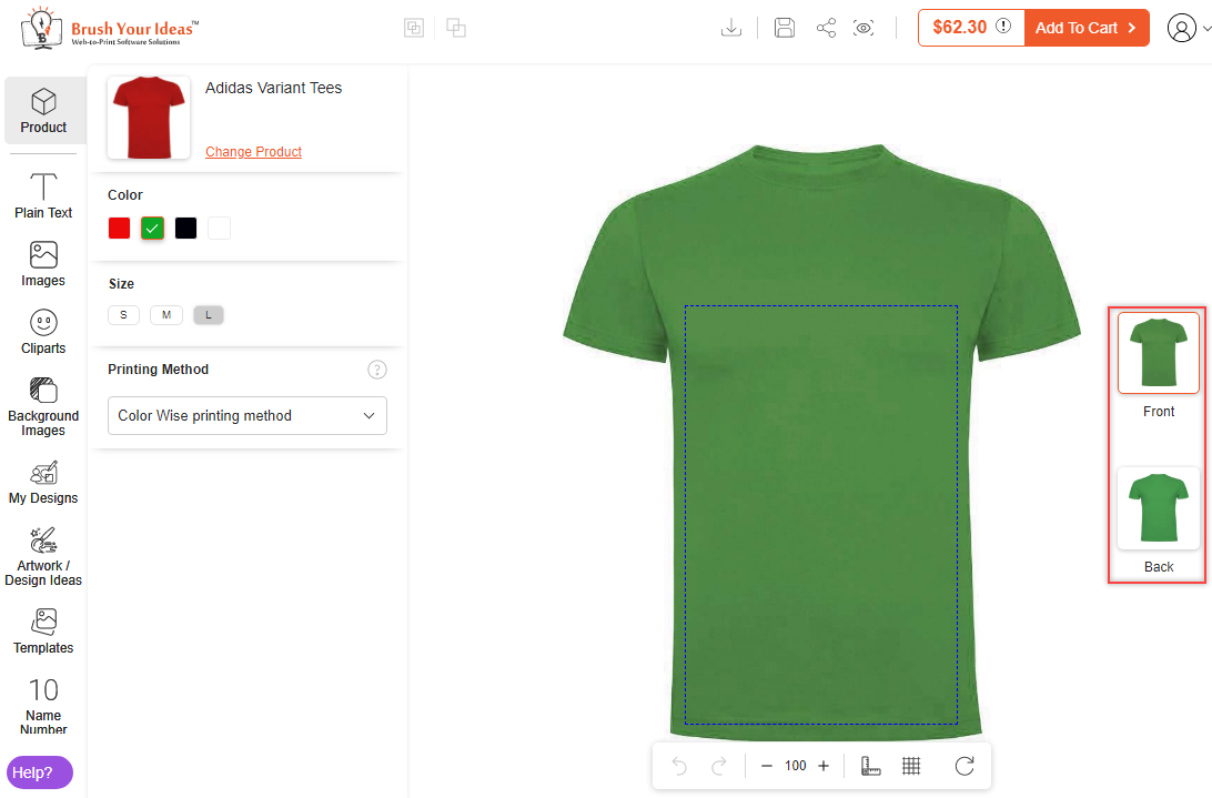
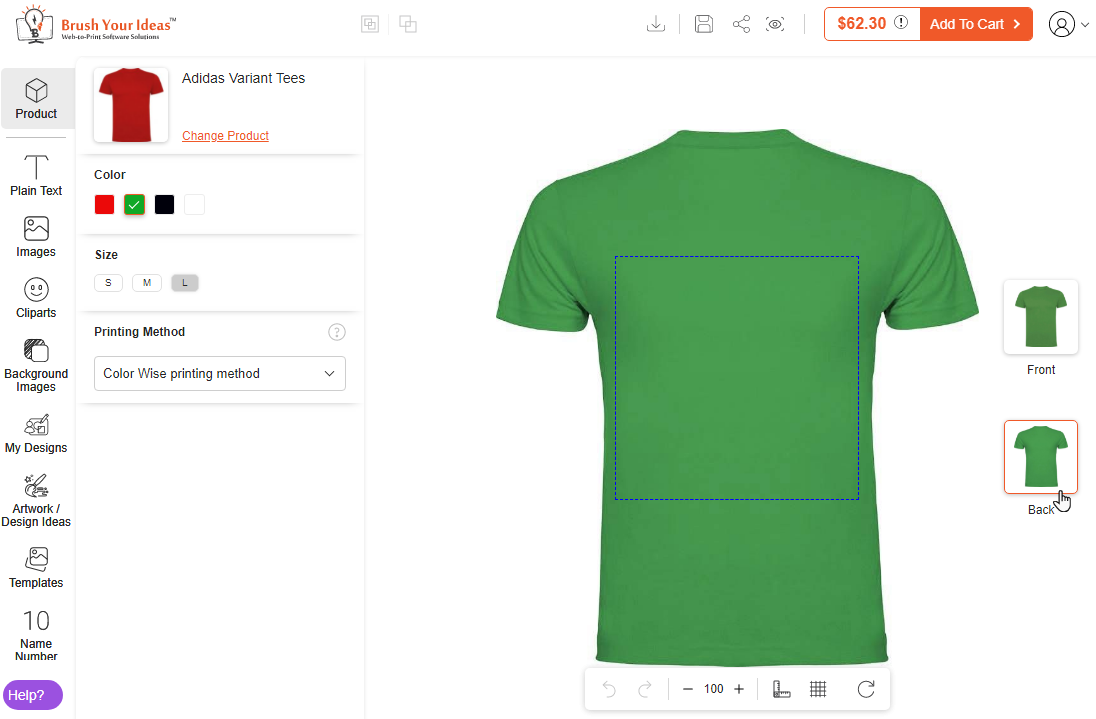
> Product Sides: If the product has multiple sides, the customers will get the name of the sides on the right side of the designer area. (Screenshot-4)
> Designing Properties/Options: The customers will get the different options and properties as Sub-tabs to edit the added objects on the designing area.
> Product Option: If you have added the ‘Configurable Product’, the product options (attributes) will appear in the Sub-tab area. The customers can select the attributes like Brand, Color, Size, etc. as configured from the product configuration. (Screenshot-5)
> Footer:
– The customers will see the options in the slider exactly below the designing area. You can enable/disable the Footer options from the “Manage Layouts”. (Screenshot-6)
– By clicking on ‘Undo – Redo’, the customer can switch among the edit history.
– The customers can zoom in and out of the designing area (product image). Plus (+) for ‘Zoom In’ and minus (–) for ‘Zoom Out’.
– The customers can enable the “Ruler” and “Gridlines”.
– The customer can reset all the design areas by clicking on the “Reset” icon. The unsaved design area will also be removed.


For Card Design Industry
You can enable and manage the tabs at the Theme level (Manage Layouts) for the Card Industry (for card products). As per the configuration in the “Manage Layouts” for the design of the card, your customer can access the Designer options on your storefront.
> Card specific Designer tool
1. Designer Explorer panel: Customers can design the card product by using the different object elements from the designer explorer panel.
2. Sub-tab of Designer Explorer: Customers will get the designer options in the sub-tab of the select tab.
3.Sides: Customers will see the sides of the card (Front-Back).
> Editing Options: Customers will get the editing options and tool options by selecting the objects on the card (designing area).
1. Editing options for objects: Customers can edit the color of their choice to design the cards. They can edit the “Opacity” and “Object Position” according to X & Y-axis.
2. Designer Tool (Operational Actions): From here, your customers can design their product using the tools.
– Customers can set the position of the object by using the “Alignment” option. Customers can edit the product design with the tools like “Duplicate” objects, “Crop” and “Best Fit”.
3. Movable slider of designing options:
– The customers will see the options in the slider exactly below the designing area. You can enable/disable the Footer options in the “Manage Layouts” from the designer tool backend configuration.
– The customer can switch among the edit history, by clicking on the ‘Undo – Redo’.
– The customers can zoom in and out of the designing area (product image). Plus (+) for Zoom In and minus(–) for Zoom Out.
– The customers can enable the “Ruler” and “Gridlines”.
– The customer can reset all the design areas By clicking on the “Reset” icon. The unsaved design area will also be removed.
– The customers can move the footer options easily around the designing area.
– The customers will see the options in the slider exactly below the designing area. You can enable/disable the Footer options from the “Manage Layouts”.
– The customer can switch among the edit history, by clicking on the ‘Undo – Redo’.
– The customers can zoom in and out of the designing area (product image). Plus (+) for Zoom In and minus(–) for Zoom Out.
– The customers can enable the “Ruler” and “Gridlines”.
– The customer can reset all the design areas By clicking on the “Reset” icon. The unsaved design area will also be removed.
The customers can move the footer options easily around the designing area.
> Layer: Customers can set the order of the objects when more than one objects are in the Product design area using the “Layer” option.
Similarly, the customers can design the backside of the card.


For Wide Layout
- Designer Explorer (Left Side)
You will see the “Designer Explorers” in the left panel. (Screenshot-1) You will see the explorer tabs like Product, Plain Text, Cliparts, Background Image, My Designs, Artwork, Templates, Name Number, QR Code, and Data. You can enable and manage the tabs at the Theme level (Manage Layouts). After the Backend configuration, your customer can access the Designer options.
Note: In Wide Layout, users will not get the text captions of the features.
– Products (All Products): You can showcase all the products with the categories.
– Sub Tab: The option of the designer explorer tabs will display in the sub-tabs as per the Manage Layouts and Store level backend configuration.
– Help?: By clicking on the “Help” icon, the new customers will get a quick user interactive tour in the product designer page itself. From there, customers can easily get guidance regarding the “PrintXpand 3.0 Product Designer Tool”.
– Other Editing Options: Your customers can edit the properties of an element like color, text, filter, effects, and much more. They can even change the opacity and object position of an element as per their requirement.
2. Header
– Layer: Customers can set the order of the objects when more than one object are in the product design area using the “Layer” option.
– Select All: Customers can select all the element of the product with the help of this feature.
– Deselects All: Customers can deselect all the element of the product with the help of this feature.
– Download Icon: The customers can download a customized product image with a watermark ( if the watermark is configured).
– Save Icon: The customers can save their designed product. They must log in to save their designed products.
– Share Icon: The customers can share their designed products using the Social Media Platform (Facebook, Instagram, Pinterest, email, and copy the link).
– Preview Icon: The customers can view their designed product on full screen.
– Product Price: The customers add the objects to the design, they will get the amount of the product and its design.
– Add to Cart: The customer can add the product on the cart.
– Login Icon: The customers can log in to their accounts on the online store.
3. Movable Sliders
The customers will see the options in the slider exactly below the designing area. You can enable/disable the Footer options in the “Manage Layouts” from the designer tool backend configuration.
In the first slider, you will get options like alignment, duplicate, crop, best fit, and delete.
– Alignment: Your customers can align left, right, vertically, bottom, horizontally, and top.
– Duplicate: Your customers can duplicate the elements of the products.
– Best Fit: Best fit features automatically fits the size of an element to the product without losing clarity.
In the second slider, you will get an option like Zoom, Ruler & Gridline, Undo, and Redo.
– Undo & Redo: The customers can switch among the edit history, by clicking on the Undo – Redo.
Note:
- After Zooming In/Zooming Out, Undo-Redo will lose its history.
- Undo Redo will be disabled by default for some features like Canvas Resize, Name & Number, & Variable Data Printing.
– Zoom In/Out: The customers can zoom in and out of the designing area (Product image). Plus (+) for Zoom In and minus (-) for Zoom Out.
– Ruler & Gridline: Customers can apply the ruler and gridline to the product.
– Reset: The customer can reset all the design areas by clicking on the “Reset” icon. The unsaved design area will also be removed.
Note: Maximum Zoom in your customers can do is 140 and minimum Zoom out is 1 for desktop. For Mobile responsive, it is 120 and 80, respectively.


Add a Simple Product
To add a product and enable the product designer, go to Catalog → Products. You will be redirected to the product list page where you can see the list of all inserted products. To add a new product, click on the “Add Product” button.
In the new product page, select the attributes and insert all required details related to the product like product name, price, quantity, category, etc.
Now, navigate to the “Images & Videos” option to upload product images with their sides.
To upload an image for the product, click on the “Browse to find” text label or drag the image there to upload the image. You can also select the relevant images as per sides.
After uploading images of a product, click on the Save button to save the product details. Once the image is uploaded and the product is saved, only then “Design Area” button will enable.
Now, the Design Areas button is enabled. By clicking on the product’s image, the ‘Image Detail’ pop-up window will appear on the screen.
Add ‘Alt Text’ as per your requirement and select the option of Role: Base, Small, Thumbnail, Swatch accordingly for the product view and any other area to display the image. After adding all the details, don’t forget to save it.


Design Areas
Once you have added the product details and its images, you must set the “Image Sides” and the “Design Area” for the product.
Click on the Design Areas button to configure the sides and the design area as per the sides.
As you clicked on the “Design Areas” button, a pop-up will appear on your screen to configure the product’s design areas.
You need to configure the following details related to configuring the design areas:
– Image Side: Select the image side from the drop-down selection. Here, you will get the Images Sides drop-down selection as per the “Product Designer → Manage Image Sides”. Select the relevant side for the product (for the selected image).
– Default Unit: Select the default unit to measure the design area i.e. Pixele (PX) or Centimeters (CM). You need to add the design area’s values as per the selected “Default Unit”.

Output-Based On
Now, you need to select the specific “Output File Generation” option from the Output Based on drop-down selection. You will have 3-options to select the Output File:
> By Product Image Size
> By Custom Size
> By Design Area Size
> By Product Image Size
If you select the “By Product Image Size”, the system will take the product’s Design Area’s measure i.e. Width, Height, Left, and Top.
You need to insert the Design Area on the product by filling up the Width, Height, Left, and Top. Here, the Width and Height define the actual size of the design area, and the Left and Top define the exact position of the design area on the product.
You can also set the design area by dragging the mouse on the product’s image. As you drag the mouse pointer on the design area (product image), the values will be changed in the “Design Area” section (Height, Width, Left, and Top).
> By Custom Size
If you select the “Custom Size”, the system will take the inputs for Custom output Size: Width & Height.
Note: You need to keep the output ratio according to the product image size for the best output result.
You can also set the design area by dragging the mouse on the product’s image. As you drag the mouse pointer on the design area (product image), the values will be changed in the “Design Area” section (Height, Width, Left, and Top).
You will see the alignment grids when moving the mouse pointer on the design area with holding the mouse pointer.
> By Design Area Size
If you select the “Design Area Size”, the Output Image Size for that Design area Image needs to be captured as soon as the design area is added.
Note: You need to keep the output ratio according to the Width & Height of the design area for the best output result.


Multiple Design Areas
You will see the design areas thumbnail for the image side at the bottom of the “Design Areas” popup. Some products could have multiple design areas on the single side. You can insert the multiple design areas on a single side of the product’s image.
By clicking on the ‘+’ (add) icon, you can add the new Design Area. If there are multiple design areas, the output size of each needs to be captured.
You must select the output methods for each design area. If you want to remove the design area, you need to click on the ‘delete’ icon of the design preview.


Design Area for Other Sides
If the product has multiple sides, you can set the Design Area for that side as well. You can customize the design areas as per the output and you can select the multiple design areas for other sides, too.
Here, you will find the other sides images you have uploaded under the “Images & Videos” that will be displayed tab-wise on the header. The product has a backside as well, so if you allow the customers to design the product for the backside, you need to define the output method (Output Based On) and design areas for the backside, too.

Masking Image
You need to select the “Masking Image” if the masking image is required to design the product. To apply the masking effect, you can select the masking file for the product image from the Masking Image drop-down list.
You will get the list of the Masking Image as per the “Product Designer → Manage Masking Images”.
After configuring the “Design Areas” and other required options, click on the Save button to apply the changes.

Enable Product Designer
To enable the Product Designer for a Product, scroll down to the “Product Designer” option and set ‘Yes’ for the ‘Enable Product Designer’ option.
You can set the default configurations for the Product for designing from the Product Designer itself.

Frontend View
Once you have set and configured the “Design Areas” for the product from the designer tool configuration (Magento Backend), your customers can see the product with the configured designing area.
If the product has multiple sides, the customers can see it on the right side of the product image. The customers can switch the side by clicking on the sides (Front, Back, or another name).
Now, the customers have a free hand to design the products using PrintXpand 3.0 Designer Tool.

Frontend View
Once the attributes are configured from the product configuration, the customers will see all the configured attributes (product’s variants) on the left side.
By clicking on the different variants like colors, size, etc., the customers can choose the different variants as per their requirements.
After designing, when the customers add the product to the cart, an ‘Add To Cart’ will pop up with the options of the product configuration (variants). So the customers can choose the different variants by clicking on the More text caption and add another product with a different variant.
")


Add a configurable product
You can create configurable products with various configurable attributes like product color, brand, size, and more. Configurable products allow customers to choose from available options while placing an order.
To create a configurable product, navigate to Catalogue → Products. To configure the existing product, click (edit) on that specific product, or if you want to create a new configurable product, navigate to the “Add Product” button.
If you are adding a new product, you need to select the attributes and insert all required details related to the product like product name, price, quantity, category, etc.
Now, navigate to the “Images & Videos” option to upload product images with their sides.
To upload an image for the product, click on the “Browse to find” text label or drag the image there to upload the image. You can also select the relevant images as per sides.
After uploading images of a product, click on the Save button to save the product details. Once the image is uploaded and the product is saved, only then “Design Area” button will enable.
Now, the Design Areas button is enabled. By clicking on the product’s image, the ‘Image Detail’ pop-up window will appear on the screen.
Add ‘Alt Text’ as per your requirement and select the option of Role: Base, Small, Thumbnail, Swatch accordingly for the product view and any other area to display the image.
After adding all the details, don’t forget to save it. The product with inserted details and selected image(s) will be saved.
Now, you can set the Design Areas and Output details for the product.


Enable Product Designer
To enable the Product Designer for a Product, scroll down to the “Product Designer” option and set ‘Yes’ for the ‘Enable Product Designer’ option.
You can set the default configurations for the Product for designing from the Product Designer itself.

Design Areas
Once you have added the product details and its images, you must set the “Image Sides” and the “Design Area” for the product.
Click on the Design Areas button to configure the sides and the design area as per the sides.
As you clicked on the “Design Areas” button, a pop-up will appear on your screen to configure the product’s design areas.
You need to configure the following details related to configuring the design areas:
– Image Side: Select the image side from the drop-down selection. Here, you will get the Images Sides drop-down selection as per the “Product Designer → Manage Image Sides”. Select the relevant side for the product (for the selected image).
– Default Unit: Select the default unit to measure the design area i.e. Pixele (PX) or Centimeters (CM). You need to add the design area’s values as per the selected “Default Unit”.

Output-Based On
Now, you need to select the specific “Output File Generation” option from the Output Based on drop-down selection. You will have 3-options to select the Output File:
> By Product Image Size
> By Custom Size
> By Design Area Size
> By Product Image Size
If you select the “By Product Image Size”, the system will take the product’s Design Area’s measure i.e. Width, Height, Left, and Top.
You need to insert the Design Area on the product by filling up the Width, Height, Left, and Top. Here, the Width and Height define the actual size of the design area, and the Left and Top define the exact position of the design area on the product.
You can also set the design area by dragging the mouse on the product’s image. As you drag the mouse pointer on the design area (product image), the values will be changed in the “Design Area” section (Height, Width, Left, and Top).
> By Custom Size
If you select the “Custom Size”, the system will take the inputs for Custom output Size: Width & Height.
Note: You need to keep the output ratio according to the product image size for the best output result.
You can also set the design area by dragging the mouse on the product’s image. As you drag the mouse pointer on the design area (product image), the values will be changed in the “Design Area” section (Height, Width, Left, and Top).
You will see the alignment grids when moving the mouse pointer on the design area with holding the mouse pointer.
> By Design Area Size
If you select the “Design Area Size”, the Output Image Size for that Design area Image needs to be captured as soon as the design area is added.
Note: You need to keep the output ratio according to the Width & Height of the design area for the best output result.


Multiple Design Areas
You will see the design areas thumbnail for the image side at the bottom of the “Design Areas” popup. Some products could have multiple design areas on the single side. You can insert the multiple design areas on a single side of the product’s image.
By clicking on the ‘+’ (add) icon, you can add the new Design Area. If there are multiple design areas, the output size of each needs to be captured.
You must select the output methods for each design area. If you want to remove the design area, you need to click on the ‘delete’ icon of the design preview.

Design Area for Other Sides
If the product has multiple sides, you can set the Design Area for that side as well. You can customize the design areas as per the output and you can select the multiple design areas for other sides, too.
Here, you will find the other sides images you have uploaded under the “Images & Videos” that will be displayed tab-wise on the header. The product has a backside as well, so if you allow the customers to design the product for the backside, you need to define the output method (Output Based On) and design areas for the backside, too.
Product Configuration Steps
Now, You can create configurable products (associated products) under the Configurations section. By clicking on the “Create Configurations” button, the Create Product Configurations window will pop up on the screen.
You need to follow the below steps to create the configurable product with associated products:
Step-1
Now select the attributes of the associated products from the ‘Select Attributes’ section by checking the checkbox beside the attributes.
Click on the ‘Next’ button to proceed further.
Step-2
After selecting the attributes, you have to select their attribute values. You can select by ticking the checkbox for relevant attribute values from the ‘Attribute Values’ section.
Click on the ‘Next’ button to proceed further.
Step-3
Now, you can upload the unique product images for all the associated products and add price & quantity as per all the combinations and attributes of a product.
To upload a unique image, click on the “Browse” to find or drag images here’ link and upload the respective image for the product.
Follow the same procedure to upload the images for all the associated products and click on the “Next” button to view the summary of the product and its attributes.
Step-4
Now, by clicking on the ‘Generate Products’ button, the products with all the uploaded images, attributes & values will be added.
After clicking on Generate Products, all the associated products will be displayed in the “Configuration” options. You can edit/disable/remove the products as per your requirement.
Note: Admin needs to set image-side manually for associated products images. The design area will be applied from the parent product. If a child product has a design area then it will give priority to the child product otherwise parent product.


")
Design Areas for Child Products
Once you added and configure the associated/child products, you also set the Design Areas and Output setup.
Now, by clicking on any associated product, you will be redirected to that product’s details page. Set the design area for the associated product.
You can set the different design areas for the associated products. You will get the Use Parent Design Area to set the similar design area and output settings that are selected for the Parent product.
By ticking the “Use Parent Design Area” checkbox, all the design area options including Masking Image, price of the design will be selected as per the design area configuration of the parent product. You cannot change the design area options.

Default Associated Product
When you have added a Configured Product, you should have also uploaded images as per the different attributes and variations.
To display the ‘default product’ on the Front End, you must select a ‘Default Associated Product’ from the Product → Product Designer option.
As you click on it, you will get the dropdown list to set a default product to display on the Front End.

Backend Configuration
You can upload the masking image for the product design. Go to the Product Designer → Masking Image.
By clicking on the “Masking Image”, you will see the list of the uploaded masking images.
You can upload a new masking image by clicking on the Upload button from the header. Browse the masking image from the folder (system) and select the image to upload here. By clicking on it, the new masking image will be uploaded. You must have an SVG format file for the masking image.
You need to insert the “Label” (Image Name) to identify the masking file during the selection for the product.
You can remove the masking image file by ticking the checkbox from the “Remove” column and then by clicking on the Save button.
Select Masking Image
Now, if the masking image is required for any product, go to Catalog → Products. Edit the product for which you want to select the masking image.
You can select the masking image for the products from the Design Areas. Click on the Design Areas button from the product details page and the “Design Areas” popup will appear.
You will find the Masking Image drop-down selection in the “Design Areas” popup. You will see the list of the masking images that are added from the “Product Designer → Manage Masking Images”.
Select the required masking image from the drop-down list and save the “Design Areas” and then save the product. The masking image will be applied to that product.
Note: If you have any doubts regarding the SVG file and how to mask the image, you can contact us. Our support team will guide you on how to mask the image.


Frontend View
When the customers design the product, it will be designed as per the masking image for that product.
")
Manage Layouts
Navigate to the Product Designer -> Manage Layouts to manage the Designer Tabs and enable the required features for the designing area.
By clicking on the “Manage Layouts”, the admin will see the two default layouts: One for the “Apparel” and another for the “Card Business”. These are ready-to-use layouts.
– Being an admin, you can edit the layout and manage the Tabs, Sub-tabs, features for the storefront by clicking on the ‘edit’ icon of any layout.
> All Tabs
The customers can see and access the designer explorer tabs from the left panel in the storefront. You can enable/disable any tab from the “All Tabs” to give access to the customers.
Click on the checkbox to enable/disable the Tabs for the product designer explorer.


Sub-Tabs & features
You can enable/disable some of the features to be displayed as Sub-tabs that are object-related options. Manage the Sub-Tabs and its features for the below tabs:
> Plain Text > Images > Background Images > Name Number
You need to click on the down arrow to expand the tab.
> Plain Text
You can enable the options that you want to allow customers to access in the Sub-Tabs of the “Plain Text” tab. You enable the following Sub-Tab options:
– Bold, Italic, Underline – Arc – Stroke – Drop Shadow
> Images
You can enable the options that you want to allow customers to access in the Sub-Tabs of the “Images” tab. You enable the following Sub-Tab options:
– Image Effects – Image Filters – White Background Removal – All White Removal – All Color Removal
> Background Images
You can enable the options that you want to allow customers to access in the Sub-Tabs of the “Background Images” tab. You enable the following Sub-Tab options:
– Background Color – Background Images
> Name Number (Addon)
As you enable/disable the features for the tabs, they will be displayed to the customers in the storefront. So, being a store admin, you can manage the tabs and object-related features for the specific tabs as per the layout that you have selected.
> Adjust Tab order
You can easily manage the tabs’ order just by drag and drop. The customers will see the tabs in the designer explorer left panel in the same order as managed here by you (Admin).


")
")
Manage Layouts
First of all, you need to enable the “Artwork” tab from the Manage Layouts for the specific Theme (Layout). Navigate to the Product Designer → Manage Layouts.
You will see the Artwork tab under “All Tabs”. Enable the Artwork tab to display it in the storefront and allow customers the choose any artwork for the product design.
After configuring the layout options, click on the Save button.


Manage Artwork
Once you have added the Artwork Category, you can add the Artwork by selecting the relevant Category. You can either add the Artwork image or design a new Artwork. To add the Artwork, go to Product Designer → Manage Artwork.
You will get the list of already inserted Artwork by clicking on the “Manage Artwork”. You will get the list with the details like ID, Artwork Category, Artwork Name, Price, Uploaded by, Storeview, Status, and Action.
To add a new Artwork, click on the Create Artwork button. You will navigate to the “Artworks Information” page by clicking on the “ Create Artwork” button.
You need to insert and configure the following options:
~ Name of the Artwork: Insert the relevant name to identify the Artwork.
~ Select Artwork Category: Select the Artwork Category from the drop-down list. If you want to assign the Child Category to the Artwork, you will get the Artwork Category with the dash “-” before the category name.
~ Store Views: Select the stores on which the Artwork will be accessible.
~ Enter Price: Insert the price for the Artwork individually. If left blank it would be considered as Zero (free). When the customers add any Artwork to the designer area, the price will be calculated to the amount.
~ Select Status: Choose the default status of the Background Images category. (Enable/Disable)
~ Methods: Here, you will get two options to add the Artwork either “Upload” the image or “Create using the designer tool”. Choose Method for Artwork.
Upload
If you have the Artwork image file in the SVG format, you can upload that SVG image using the Upload method.
Once the image is uploaded, you will see the preview of the Artwork’s image. You can delete the uploaded Artwork’s image by clicking on the ‘delete’ icon.
Note: The Artwork’s image must be in SVG format.
After inserting all the details, click on the Save button to add a new Artwork. Now, the Artwork will be added to the list.
Create using the designer tool
If you want to design and create an Artwork by yourself, select the “Create using the designer tool” method. Here, the Parent Artwork Category is selected.
Select the Create using the designer tool method to design the Artwork by yourself. After selecting the method, click on the Save button. Now, the Artwork will be added to the list.
By clicking on the “Select” drop-down, you will find the Use for template and design options. Click on the “Design” option to design the Artwork using the designer tool.
You can design the Artwork using the designer explorers and the different tools. You will have two options here to set the shape of the Artwork design: Square and Rectangle.
If you choose the “Rectangle” shape, again you will have two options for the Rectangle: Landscape and Portrait. You can choose the shapes for the artwork design according to specific products.
Using Objects & Elements
The product designer who designs and manages the designs for your online store will have a free hand to design the artwork.
1. You (Product Designer) can add the Text, Upload the Images, Add the Cliparts, and Background Images to create an excellent artwork that is ready-to-use.
2. Use the object’s properties and options to edit the design.
3. Once artwork is created, click on the ‘Preview’ icon to view the designs. If everything is done correctly, click on the ‘Save’ icon to save the Artwork.
Once you saved the Artwork, you will see the popup of the successful creation of the Artwork. Click on the OK button and go back to the store.
The new artwork using the designer tool is saved and listed in the Artwork. Once the Artwork is created using the designer tool, you can also use it for the template.
Click on the “Select” action to use the artwork for the template. You will see the Use for template option in the select drop-down list.
By clicking on the “User for template”, you will get the popup named “Product Selection”. You need to select the product(s) to create a template of the artwork.
After selecting the products for the template, click on the Continue button. You will see the “Template created successfully” message on the header.
By navigating to the “Templates” (Product Designer -> Templates), you will see the created templates for the selected product(s) using the artwork. It will take few mins for the template to be updated here.
After some time, you will see the Templates using the Artwork for the selected products.


Artwork- Use For Template
Click on the “Select” action to use the artwork for the template. You will see the Use for template option in the select drop-down list.
By clicking on the “User for template”, you will get the popup named “Product Selection”. You need to select the product(s) to create a template of the artwork.
After selecting the products for the template, click on the Continue button. You will see the “Template created successfully” message on the header.
By navigating to the “Templates” (Product Designer -> Templates), you will see the created templates for the selected product(s) using the artwork. It will take few mins for the template to be updated here.
After some time, you will see the Templates using the Artwork for the selected products.


")
Frontend View
After configuring the Artwork Categories and Artwork from the backend configuration of the designer tool, the customers can add the Artwork to their product design. They will get the “Artwork” tab to the designer explorer panel (left side). [1]
The customers will see all the Artwork with different categories that are created or added from the “Manage Artwork”. They can add the artwork by simply drag & drop or by clicking on it from the Artwork list in grid view. [2]
Note: The customers can add only one artwork at a time to the designing area. If artwork is already in the designing area and the customers try to add another artwork, they will get the popup message for the artwork replacement. [3] By clicking on the OK button, the artwork will be replaced. [4]
You can also view each element of the artwork in the Layers section with their respective icons which will help your customers to easily manage the elements. [5]


Mobile Responsive
PrintXpand 3.0 Designer Tool is also responsive for mobile/tab devices. So, the customers can easily access the online store from Mobile or Tablet devices to design their desired products.

Manage Layouts
First of all, you need to enable the “Designer Explorer” and “Designer Tools” options from the specific theme (Layout). Navigate to the Product Designer → Manage Layouts. By editing the layout, you will see two options Front-end and Admin.
Front-end
You must enable the “Template” tab from the Layout if you want to allow customers to access the Templates tab in the designer explorer panel to the online store.
Admin
You must enable the “Template” tab from the Layout if you want to allow customers to access the Templates tab in the designer explorer panel to the online store.
You must enable the required options for the “Template Design” to create a product template using the designer tool.


Create Templates
Now, go to the Product Designer → Manage Templates to create and manage the templates for the specific products. [1]
You will see the list of the templates by navigating to the “Manage Templates” page. You will see the detail in grid views like ID, Template Name, Product Name, Price, Template Thumbnail (template image), Store View, Visible on Front, and Action. [2]
To add a new “Design Template”, click on the Create Template button. You will navigate to the “Add Design Templates” page. You need to select the product from the product list. [3]
After selecting the product, click on the “Design Templates Information” option to insert the Template’s information. You need to insert the following information of the template:
– Template Name: Insert the relevant name of the template that will be displayed on the storefront.
– Visible in front: Enable this option to make the template visible in the storefront. [4]
– Methods: You will get three methods to create and manage the template for the product.
> Upload Artwork > Choose Artwork > Go To Design
Upload Artwork
To upload a ready-made artwork (SVG file) you have to choose the Upload Artwork option. [5]
Click on Save once you have uploaded the file.
NOTE: The price of the template will be 0, if the admin designs that artwork then the decoration price will be added and displayed in the grid.
Choose Artwork
You can choose the existing artworks that are created under the “Product Designer → Manage Artwork”. By clicking on the Choose Artwork method, the “Select Artwork” popup will appear.
You can also filter the Artwork by selecting the “Category”. By clicking on the “Please Select Category” drop-down selection, you will get the list of the artwork categories. You need to select the artwork and save the Template. [6][7]
Artwork selected will be used as a template and admin will be redirected to the template listing page.
NOTE: Price of the template will be the price which is added at the time of creating artwork.
Create Template using Designer Tool
To create a template using the designer tool, click on the Design It option and then click on the Save and Continue button.
The template will be saved and you will be redirected to the “Product Designer tool” page to create a design.
Admin users or product designers for the online store will have free hands to design the template for the specific product. Similarly, if the product has another side, you can design for another side as well.
After adding any decorations, final pricing will be displayed on the top right side of the page, that price will be considered as template final price. [8]
By clicking on the ‘Save’ icon, the template will be saved with the created design.
It could take a few minutes to appear in the Templates record. Now, navigate to the Manage templates listing page, you will get the newly added template.
In the Actions drop down menu you will be able to see following options which you can perform by selecting the templates by clicking on the respective checkboxes :
– Delete : This option will delete all the selected templates.
– Enable : By selecting the templates you will be able to enable all the selected templates.
– Disable : By selecting Disable you will be able to disable all the selected templates.
Now, you will get the three Action options by clicking on the “Select” drop-down option: Edit, Copy, and Design.
– Edit: You can edit the template records. But, you cannot change the product or add the product.
– Copy: You can copy the existing template.
– Design: You can redesign the template by clicking on the “Design” option.
> Copy:
You can copy the existing template and create the template for the new product using the same template design. By clicking on the “Copy” option, you will get the Product Selection popup to select the product.
Once the product is selected, click on the Continue button to copy the template.
It will take a few seconds to copy the template for the selected product and to get listed in the “Manage Templates”. You will see the template design (thumbnail) after a few minutes.


Product Level Template
You can see the preloaded (default template) at the product level for the single and configurable product. If you have a single product, you need to select the “Pre-Loaded Template” to load the template on the product.
To set a “Pre-Loaded Template” which would be displayed on the storefront for the specific product, select the template from the Pre-Loaded Template dropdown list. [1]
You can set the design template for all the child products in a configurable product. The parent product will carry the latest updated child’s design template and the child products without any design templates will follow the parent product template. Select the Default Associated Product. [2]
After selecting the default template, click on the ‘Save’ button to save all the configurations.


Frontend View
Once the design templates are managed and configured from the backend, your customers can load the Default Templates by clicking on the ‘Templates’ tab in the Product Designer Page.
They can view the Design Templates as per the assigned Design Template categories to the product.
The customers can also search the templates by name from the ‘Search by Name’ text field. Also, the product will be shown with the default template assigned at the product level while searching in the product tab.
By clicking on the “Leave” button, the product will be changed.

")


Mobile Responsive
PrintXpand 3.0 Designer Tool is also responsive for mobile/tab devices. So, the customers can easily access the online store from Mobile or Tablet devices to design their desired products.

Backend Configuration
To add and manage the sides of the product images, navigate to Product Designer → Manage Image Sides. By clicking on it, you will get the list of inserted image sides with the details like ID, Image Side, Status, Action.
To add a new image side, click on the “Add Image Side” button. By clicking on it you will be redirected to the “Add Image Side” page.
Enter the following details:
– Image Side: Enter the name of the Image side. (e.g Front, Back)
– Status: Select the current status for Image Side.
After inserting the details, click on the “Save” button and you will be redirected again to the list of Images sides.
You can edit any Image side by clicking on the “Edit” option. If you want to delete any image side, select it and click on “Delete” from the ‘Actions’ dropdown. By clicking on it, a confirmation message will appear. Press “OK” to delete the selected image side.
Image sides selection
You need to select the sides for the product images. The side selection is provided at the product level. Navigate to the product details from the Catalog → Products.
You will see the “Design Areas” button from the product details page on the header.
By clicking on the Design Areas, the Design Area popup will appear where you can manage the design-related details. After selecting the side, click on the Save button to save the changes.


Frontend View
The customers will see the sides of the product on the PrintXpand- Product Designer Tool in the storefront. The customers will get the sides on the right side of the designer canvas that is available for the product.
Here, the customers can see the Front side of the product image where they can design their own style.
By clicking on the “Back”, the customers will see the Backside of the product image where they can design the product.
Backend Configuration
First of all, you need to enable the “Object Operations” options from the Manage Layouts for the specific Theme (Layout). Navigate to the Product Designer → Manage Layouts.
After enabling the required options, click on the Save button.

Object Alignment
The customers can manage the alignment of objects in the product design. They can select all the objects by clicking on the “Select All” icon from the header. If they want to deselect all the objects, they will find the “Deselect All” icon beside the Select All icon. [1]
They will get the “Object Alignment” option as a floater on the product design. The following options are given to manage the alignments: [2]
– Align Left: Click on this icon to align the object towards the left in the canvas.
– Align Horizontal Center: Click on this icon to align the object in the center horizontally in the canvas.
– Align Right: Click on this icon to align the object towards the right in the canvas.
– Align Top: Click on this icon to align the object towards the top in the canvas.
– Align Vertical Center: Click on this icon to align the object in the center vertically on the canvas.
– Align Bottom: Click on this icon to align the object towards the bottom of the canvas.
If three or more objects are selected, the last two ‘Alignment’ icons (Distributed Horizontal, Distributed Vertical) from the ‘Alignment’ section in the Designer Tool will be enabled. [3]
The customers can align the objects horizontally/vertically to maintain the distance by using both icons.


Layer Management
Using the PrintXpand 3.0 product designer tool, the customer can View/Hide any object, Lock and Delete the objects. It is possible to manage the order of the objects with the ‘Back’ and ‘Front’ options with regard to other elements.
By clicking on the “Layer” icon, it will expand and display all the options of layer management for individual design objects. These options include View/Hide, Back/Front, Lock and Delete.
View / Hide:
The customers can View & Hide any object by clicking on the View/Hide icon. In the layer management panel, the view icon of the hidden object can be seen in Red.
Back / Front:
By clicking on the Front/back icons, the customers can manage the Forward/Backward positions of the object as per their need.
Lock:
Click on the lock icon, to lock the position of an object. This will prevent the user from changing the position of an object. But, users can still edit the properties of an object and can place text above it.
Delete:
To delete any of the object layers, click on the ‘Delete’ icon beside that particular object.
Bring Forward: To forward an object. i.e. 3rd position to 2nd position. (This option is also available in the layer management panel)
Bring Backward: Too backward an object. i.e. 1st position to 2nd position. (This option is also available in the layer management panel)
Layer in Designer Tool
Your customers can also manage Forward/Backward object positions from the Right side in the Layer section. Your customers can manage positions when the objects are more than two. On the right side, there are four options are given:
Bring Forward: To forward an object. i.e. 3rd position to 2nd position. (This option is also available in the layer management panel)
Bring Backward: Too backward an object. i.e. 1st position to 2nd position. (This option is also available in the layer management panel)
Note: ‘Send to Back’ and ‘Send to Front’ options are enabled based on the selected object in the product design area.


Object Grouping
Your customers will get the option to group the objects together and edit them in the group easily. They can also manage the alignment of the grouped objects. [1]
The selected objects will be set in the group. Ungroup them by clicking on the ‘group’ icon from the header. [2]
You can Hide/Unhide the group you have created. You can also lock the position and delete the created group. [3]


MANAGE PRINTABLE COLORS
You can provide the Printable Colors to the customers as per the compatibility of your printer or availability of printable colors. The customers can select only those colors which you have added and enabled.
Backend Configuration
You can add and manage the Printable Colors from the backend configuration. To manage the Printable Colors, go to Product Designer → Manage Printable Colors.
You will get the list of already inserted printable colors by clicking on “Manage Printable Colors”. You will get the list with the details like Printable Color ID, Color Name, Color, Store View, Status, and Action to Edit.
Add New Printable Color
To add a new Printable Color, click on the Add Printable Color button. By clicking on the “Add Printable Color” button, you will be navigated to the “Add Printable Color” page.
Now, add the following details:
– Name: Insert the printable color name.
– Store View: Select the stores on which the color will be accessible.
– Color Code: Choose the color using the color picker tool or you can insert the hex color code of the specific color.
– Select Status: Choose the default status of the printable color. (Enable/Disable)
After inserting all the details, click on “Save Printable Color” and then a Color will be saved.
Now, the newly added printable color will be added to the list. You can edit any color just by clicking on “Edit” under the Action column.
Delete and Enable/Disable Status
If you want to ‘Delete’ any Color, select the color and click on the ‘Delete’ option from the ‘Actions’ dropdown list. A confirmation pop-up will appear after you click on the ‘Delete’ option. Select “OK” to perform the delete action.
Similarly, you can change the printable color status to Enable / Disable from the ‘Actions’ dropdown list.
Import Color
You can import the colors using the CSV file. Click on the Import button beside the “Add Printable Color”. You will redirect to the “Import Printable Colors” page to import the CSV file of the Printable Colors.
Download the “Sample File” to see the format of the Printable Colors in the CSV file. You need to add the exact format as in the Sample File. Once data is added, upload the file and click on the Import button. The data will be added to the list.


Store Configuration
Set Default Color
The customers will get the pre-selected color and the text objects will appear in that default color when they add to the design area. To set the default color, go to Stores → Configuration → Text Configuration.
Here, you will find the “Font Color” option to set the default color for all the color selection properties.
The color that is selected here for the Font will be the default color for all the color properties in the storefront.
")
Backend Configuration
Enable the Image Effects & Filter options for the image object while the customer is designing the product. Go to Product Designer Tool → Manage Image Effects And Filters.
You will get a list of the different image effects. You will see the details like ID, Effect Name, Status, is Filter, and Action to edit in grid view.
To ‘edit’ any of the image effects from the list, click on the “Edit” option. You will redirect to the “Edit Image Effect” page to edit the image effect details.
– Effect Image: You can update the image for the specific image effect. Click on the ‘Upload’ button and select the file to be uploaded for the Image Effect. The image must be in JPG, JPEG, GIF, or PNG format.
– Status: Choose the current status for the image effect. (Enable/Disable)
After editing the image effects, click on the Save button to apply the changes to the store.


Frontend View
When the customers upload the image having formats like JPG, JPEG, GIF, or PNG, they will get the Image Filters and Image Effects options in the sub-tab that are enabled from the “Manage Image Effects And Filter” backend configuration.
Image Filters
The customers will see the “Image Filters” in the slider. They can search for more Filters by clicking on the right arrow >.
The customers can apply the different filters to their images using the “Image Filter” option.
The customers can remove the applied filter by clicking on the ‘refresh’ icon beside the “Image Filters” label.
Image Effects
The customers will see the “Image Effects” option with a slider to increase/decrease the intensity. The customers can apply the effects of the image by moving the slider left-right.
The customers can remove the applied effects by clicking on the ‘refresh’ icon beside the percentage of the intensity.
Note: These Image Effects and Image Filter will apply only to the JPG, JPEG, GIF, and PNG formats. But, if the file format is SVG, the customers can only change the internal colors of that image.


Backend Configuration
You can customize the Images options from the Layout (Theme) and configure the default option at the store level.
")
Store Configuration
For custom image upload configurations, go to Stores → Configuration → Custom Image Upload.
Configure the custom image upload options as follows:
– Show Instruction: Select ‘Yes’ to show instructions while uploading a custom image.
– Instruction Text: Enter the instructions to be displayed while uploading the custom image.
– Allowed Extension for Upload: You need to select the file format to allow the customers to upload the images with the selected formats. They can upload the images having PNG, JPG, JPEG, PDF, SVG, EPS, and AI formats.
– Enable Image Limit: Select ‘Yes’ to set a limit for uploading a custom image. This avoids the overlapping of more images in the product design area.
– Image Limit: Enter the limit for uploading maximum images.
– Error Message: Enter the error message to be displayed if the number of images exceeds the limit of custom images.
– Minimum Size of Image: Enter the minimum size of an image in MegaByte (MB).
– Maximum Size of Image: Enter the maximum size of an image in MegaByte (MB).
– User’s Confirmation Before Uploading Image: Select ‘Yes’ to ask for the customer’s confirmation.
– Text for User Confirmation: Enter the relevant confirmation message which will be displayed above the Upload Image button.
General
– Cloud Convert: Enable this field for the best output if gradient or shadow colors are uploaded in SVG.
– Cloud Convert Key: Insert the Key if you have to enable the Cloud Convert functionality.
Note: For Cloud Convert customization charges will be applicable as it is a 3rd party integration API.
After configuring the “Custom Image Upload”, click on the Save Config button to apply the changes to your online store.


Frontend View
The customers can design their product by uploading their desired images from their devices (system/mobile). They will get the Custom Image Upload tab from the designing explorer panel.
The customers can upload images by clicking on the “Upload Image” sub-tab of the Images.
Now, the customers can browse the desired images that they want to upload for the product designing by clicking on the ‘upload’ icon.
If you have enabled the “User’s confirmation before uploading image” option from the backend (Custom Image Upload), the customers will have to check the confirmation checkbox to upload any image from the system’s folder.
When the image is uploaded, it will display in the sub-tab. By clicking on it, the images will be added to the product designer area.
When the customers click on the ‘layer’ icon, they can see the icon of the image which helps the customers to easily manage it with the other elements.
Image editing
After uploading the images, users can edit the image from the ‘Designer Tools’ (sub-tab) like “Image Filters”, “Image Effects”, “Skew”, “Opacity”, and ”Object Position”.
These image options will enable as per the Layout configuration (Manage Layouts).
The customers who have signed up to your online store will see their uploaded images by click on “Get Your saved Images”.
Note: Customers should be logged in to their accounts to get the previously uploaded images.
Crop:
The ‘crop’ option will appear as a floater in the designing area. The customers can ‘crop’ uploaded images that are in PNG, GIF, JPEG, and JPEG formats but the SVG format images will not support the cropping features.
To ‘Delete’ any of the uploaded images, customers can click on the ‘Delete’ icon which would appear on dragging mouse cursor on a particular image.
Album
If the customers have uploaded many products, they will see all the products under the “Album” option.
You can see more uploaded images by clicking on the “View All” caption.


Backend Configuration
You can enable the image editing features and the options from the specific Theme (Layout). Navigate to the Product Designer → Manage Layouts.

Frontend View
Drag and Drop Images
The customers can easily drag and drop the images from the system’s folder to the designer areas. The customers can also drag and drop the uploaded image from the left.
Crop Features
The customers can use the cropping feature to adjust the uploaded image to fit in the designing area. The Crop option is given along with the alignment tool that shows as a floater on the designing area.
The customers will get the “Crop Image” popup to remove the unwanted part of the image using the cropping tool on the image and adjust the image.
Once you crop the image, click on the Apply Crop button to cut out some of the parts of the image.
Note: The SVG format images will not support the cropping feature.
Background Removal
The customers will get the “Remove Background” option that is enabled if you have enabled it from the Layout. Once the customers uploaded the image and it has a white background, they can remove the background by clicking the “Remove Background” option.
Note: After Removing the Background, the cropped image will not change its form


DOWNLOAD DESIGNED IMAGE
PrintXpand 3.0 product designer tool allows customers to download their designed product’s image to their system easily.
After designing the product image, your customers can easily download the designed product images. They will find the Download icon on the header.
By clicking on the ‘Download’ icon, the designed image will be downloaded where you want to save it.

Backend Configuration
You must enable the Watermark from the Product Designer → Manage Layout → Enable “Watermarking”. You need to enable the watermarking option to add the watermark during the download of the designed product. [1]
The customers can see the watermarked product image when they preview and download the designed product. To set the watermark to be displayed, go to Stores → Configuration → Watermark. [2]
Configure the following options for the Watermark:
– Watermark Type: By selecting the watermark, choose the available options to set the watermark as ‘Image Or ‘Text’.
– Image Watermark: Choose and upload an image that you want to add as a watermark when customers preview and download the designed products. The image must be in PNG format. [3]
After selecting the image, click on the “Save Config” button to save the uploaded image.
After saving the configuration, you will see the uploaded images besides the “Add Image Watermark”.
– Delete Image: To delete the uploaded watermark image, check the “Delete Image” checkbox and clicking on the Save button. After saving the configuration, the image will be deleted.
– Text for Watermark Image: Insert the text to be displayed as a watermark in the designed product’s preview and downloaded image. [4]
You must create a watermark image to display the text as a watermark. Click on “Create Watermark Image” to create a watermark image.
You will get a popup message when the text watermark is generated. Click on OK and save the configuration. [5]


Frontend View
After configuring the watermark from “Stores Configuration”, the customers will get the watermark when they preview the designed product.
Image Watermark: It will be displayed the uploaded image/logo over product preview. When the customers download the designed product’s image, they will get the image watermark including it. [1]
Text Watermark: It will be displayed the uploaded image/logo over product preview. When the customers download the designed product’s image, they will get the image watermark including it. [2]
If they download the designed product’s image, the image will contain the watermark as well. [3]


Backend Configuration
To change the text direction and layout position “Left to Right” to “Right to Left”, navigate to the Stores -> Configuration -> Product Designer Tool.
Under the “General” settings, you will find the “Text Direction” setting to change the Text direction & the layout “LTR to RTL”.

Frontend View
By changing the “Text Direction” option, the position of the designer tool, designer explorer, and all the content will be reversed and the text direction will be changed to Right To Left.
The customers will see all the content of the Product Designer in reverse from if you have selected Text Direction as RTL.
 Text Direction")


Manage Layouts
First, you must enable the Shapes from the Manage Layouts for the specific theme (layout). Navigate to the PRODUCT DESIGNER → Manage Layouts and edit the theme (layout) in which you want to enable the “Shapes” in the product designer tool for your online store.
You will see the Shapes tab under the “All Tabs”. By checking the “Shapes” menu box, you can enable the shapes in the product designer explorer menu in the front view.


Manage Shapes
You need to enable the Shapes menu from the Layout if you want to allow the customers to design their products by adding the masked shapes in the designer area.
Navigate to the PRODUCT DESIGNER → Manage Shapes. You will be redirected to the “Manage Shapes” page where you can see the existing list of the added shapes. [1]
By clicking on the Add Shape button, you will be redirected to the “Add Shapes” page to add a new shape. [2]
You can add a new shape by clicking on the “Add Shape” button or you can edit the existing shape to modify the details. [3]
Select the following details:
– Shape Name: Insert the relevant name of the shape
– Main Image: Select the original image of the specific shape
– Masking Image: Select the masking image of the original image of the shape
– Status: Enable/Disable the status as per requirement
After inserting the information and uploading the images, click on the Save button to add a new shape.


Frontend View
If you have configured the Shapes from the backend, the customers will design the product by adding shapes to the designing area. [1] The customers can add the shape into the design are simply by clicking on any shape from the grid. [2]
Now, the customers add the images or clipart on the shape. [3] When the customers add the clipart, it will be shown inside the boundaries of the shape. [4]
The customers can add multiple shapes to the product designing area to design the product as per requirement. [5]
No Shape
You can remove the shape if it is not required for the product design. You need to select the shape from the product designing area and click on the No Shape option from the Shapes grid. [6]
By clicking on the “No Shape”, the customers will get the popup to remove the shape. [7]
By clicking on the Yes button from the popup, the shape will be removed and the added image/clipart will remain in the designing area. [8]
Similarly, the customers can also remove the shape from “Layer Management”. [9]
By clicking on the ‘layer’ icon, the customers will see the No Shape icon. By clicking on it, the shape will be removed but the image/clipart will remain in the designing area.
Delete Shapes
If the customers want to delete the shapes, they need to select the shape. After that, by clicking on the ‘delete’ icon from the ‘editing tool’ tab or pressing the delete key from the keyboard, the shapes will be deleted including the added image/clipart.


Mobile Responsive
PrintXpand 3.0 Designer Tool is also responsive for mobile/tab devices. So, the customers can easily access the online store from Mobile or Tablet devices to design their desired products.

Manage Layouts
First of all, you need to enable the “Cliparts” tab from the Manage Layouts for the specific Theme (Layout). Navigate to the Product Designer → Manage Layouts. [1]
You will see the “Cliparts” under the All Tabs. [2]
The customers will see the Clipart tab in the storefront only if it is enabled from the Manage Layout. You can enable the designer tool features from the right-side options (Action Panel, Object Operations, and Others. After configuring the layout options, click on the Save button.


Manage Clipart Categories
You can manage and categorize the Clipart images. It is easy to set the parent and child categories for the Cliparts. To add and manage the Clipart and its Category, go to Product Designer → Mange Clipart Categories. [1]
As you click on “Manage Clipart Categories”, you will navigate to the Cliparts listing page. You can manage and edit them as per your requirement. [2]
Add new clipart category
Click on the Add Clipart Category button to add and manage the Cliparts. You will be redirected to the “Add Clipart Category” page where you need to insert the details and assign the Root Category (Parent) with the images. Now, insert and configure the following details: [3]
~ Title: Insert the relevant name of the Clipart.
~ Assign as Root Category: Enable this option if the clipart category is the Root (Parent) category of the images. If you disable this option, you can see the “Category” drop-down selection to select the Root category (Parent Category) for the new clipart.
~ Category: Select the parent category from the list. The customers will see the child category under its parent category. Here, the “Character” is selected as the parent category.
~ Status: Choose the default status of the clipart category. (Enable/Disable)
~ Clipart Images: You need to browse and upload the clipart images. The formats must be JPG, JPEG, PNG, SVG. [4]
You will see the uploaded clipart images in the grid view. Here, you need to insert the following details:
~ Label: Insert the clipart image’s text label, so the customers can search the image by inserting the text label.
~ Tags: Insert the Tags for the clipart image.
~ Position: Insert the position to manage the sequence of clipart images.
~ Price: Insert the price for the clipart images individually. The price will be shown as a tag on the clipart image in the storefront. When the customers add any clipart image to the designer area, its price will be added to the total amount.
~ Select Status: You can set the default status of the clipart image (Enabled/Disabled).
~ Remove: If you want to delete any image, check the checkbox of the “Remove” and save the configuration.
After inserting all the details for the clipart, click on the Save button to add a new Clipart Category. Now, the newly added Clipart will be added to the list. [5]
Root Category
Here, you can see the added clipart category is not a Root Category because its parent category is selected.
But, if you want to add a new clipart category as a parent (root) category, you need to enable the “Assign as Root Category?” option. [6] So now, the Clipart Category is added as a parent category. [7] You can upload the clipart images with the specific formats only like JPG, JPED, PNG, and SVG.
After saving the clipart images, the category will be listed and you can see the added clipart category is a Root Category. [8]
Edit, Delete, and Status
You can edit any category just by clicking on “Edit” under the Action column. [9]
If you want to ‘Delete’ any clipart category, select the category and click on the ‘Delete’ option from the ‘Actions’ dropdown list. A confirmation pop-up will appear after you click on the ‘Delete’ option. Select “OK” to perform the delete action.
Similarly, you can change the clipart category status to Enable / Disable from the ‘Actions’ dropdown list.


Clipart Configuration (Store)
You need to configure the General Settings of the Clipart to be displayed as default in the storefront. Go to the Stores → Configurations → Clipart. The general clipart configuration is shown below:
~ Set Default Clipart Category: Select a default Clipart Category which will be displayed in the storefront when the customers click on the “Cliparts” tab. Here, you will get all the Clipart records in the drop-down selection. You need to select Category to make it default.
~ Enable Clipart Limit: Select ‘Yes’ to set maximum clipart allowed in a single design area.
~ Clipart Limit: Insert the No. of the Clipart limit so the customers cannot exceed that limit on the single design area.
~ Error Message Clipart: Insert the relevant Error Message which will be displayed when the customers exceed the limit.
")
Clipart Configuration at Product level
You can also select the default clipart category for the specific products. When the customers load the product to design using Clipart images, they will see the default clipart category that is selected as Default Clipart Category in the product.
You will get the list of the “Clipart Category” in the drop-down. After selecting the Default Clipart Category, click on the Save button to apply the changes.
Note: If you have not selected the “Default Clipart Category” at the product level by default, the customers will see the default clipart category that is selected at the store level (Store Configuration).

Frontend View
After configuring all the Cliparts settings from the designer tool backend configuration, the customers can add the clipart and design their product with some unique design!
The customers can see the Clipart tab on the designer explorer panel (left side). [1] The customer will see the default Cliparts in the sub-panel when they click on the Cliparts. If you have added the price for the clipart images, the customers can see the price tag on the clipart images. too.
Now, the customers can add their favorite Clipart image by clicking on the clipart image or simply dragging the clipart to the designing area.

Image File & Edit options
If the added clipart’s format is an SVG file, the customers can apply the “Clipart Colors”.
1. Clipart Colors – The customers will see the colors of different elements. They can change the color by clicking on the color.
2. The customers can also set different properties of the clipart image. (i.e. Opacity and Skew)
The customers can design the product with their ideas of color combinations by clicking on the color that belongs to the different elements.
The customers will have a free hand to design their product using clipart images. They can design and edit the clipart image using the designer tools that are enabled by you (Admin).
Note: The customers can crop the Clipart Images but the cropping will not be applied on SVG format images.
If the customers have added the clipart image other than the SVG file (PNG or JPG), they will get the “Image Effects and Filter” options.
1. The customers can filter the clipart image. The filter options will appear as per the “Image Filter” configuration.
2. The customers can also set different properties of the clipart image. (i.e. Opacity and Skew)


Maximum Cliparts
The customers can add the clipart images to the design area that are set from the store configuration for the Clipart. If they exceed the limit, they will get an alert message.
The customers can filter and search the images by inserting the ‘text label’ or by clicking on the ‘Filter’ icon under the “Clip Art” option.

Clipart Icon in Layers
When the customers click on the ‘layer’ icon, they can see the icon (thumbnail) of the clipart so that the customers can easily manage it with the other elements.

Filter and Search Clipart Categories
The customers can select the clipart category from the list. If any child category is there, the customers will see the “+” icon beside the clipart category’s name. [1]
So. after selecting the clipart category, the customers need to click on the Apply button to search for the results. The customers can see more Clipart images by clicking on the “Load More” text caption. [2]


Price Details (Detailed Live Pricing)
The customers will see the pricing details once they hover the mouse beside the Amount display. The customers will be charged as per the price that is added in Clipart’s image details.

Mobile Responsive
PrintXpand 3.0 Designer Tool is also responsive for mobile/tab devices. So, the customers can easily access the online store from Mobile or Tablet devices to design their desired products.

Backend Configuration
Navigate to the Product Designer -> Manage Layouts to enable and manage the User Tour to display the instructions to the customers. [1]
By clicking on the Apply button, you will be navigated to the User Interactive Tour page. Here, you will find the different tabs for the guiding tour in your storefront. [2]
By clicking on the accordion (down arrow) of any tab, you can enable and insert the details as below: [3]
– Enable Tab for Tour: Click on the switch to enable the interactive tour for the selected tab.
– Tour Title: Insert the text labels to display as the title of the section.
– Tour Introduction: Insert an instructive message so the customers can understand the features and flow.
Similarly, you can enable the tab for the tour by inserting the Instructive details. [4]
You can easily manage the order of the steps just by drag and drop. The customers will get the tour sequences as per the order of the steps set. [5]
After managing the User Interactive Steps, click on the Save button to apply the changes to your online store.


Frontend View
If you have enabled and managed the “User Interactive Tool” from the designer tool configuration (Manage Layout), the customers will get the user’s guide when they navigate to the designer tool for the first time.
By clicking on the Next button, they will see the next guide as the order is set from the “User Interactive Tour”. The customers will find the “Help” (User Guide) option at end of the designer explorer panel.
By clicking on the “Help”, the User Guide will be started as managed from the “User Interactive Tour” (Manage).
")
")
")

Manage Layouts
Navigate to the PRODUCT DESIGNER → Manage Layouts to enable the QR code feature [1]. By clicking on the Manage Layouts, you will get the list of created layouts for the different products.
Now, by clicking on the “Edit” option of any layout, you will be redirected to the edit page of the layout. [2]
After landing on the edit page, enable the “QR Code” feature for both the Front end and Admin (If you want). Once you enable the feature, click on the “Save” button to enable it on the respective side. [3]
Let’s check how admins can add the QR codes in the templates.

")

Manage Templates
Navigate to the PRODUCT DESIGNER → Manage Templates to design the template and add the QR code to the product. [1]
By clicking on the Manage Templates, you will get the list of created templates for the different products. [2]
Now, by clicking on the “Select” option of any designed template, you will see the three options to manage the designed template. [3]
– Edit: You can edit the template details, but you cannot change the designing methods and the product that is already selected. You can edit only the following details: [4]
> Template Title > Price > Store View > Visible in Front [5]
– Copy: You can copy the template.
– Design: If you have added the new template, you need to design the product template by clicking on the “Design” option.
Once you have created the template using any of the methods, you can apply the QR code for the objects from the “PrintXpand-Designer Tool” for the admin.
By clicking on the Design option, you will be redirected to the page of the PrintXpand Designer Tool for admins. You can design the product as per the requirement. [6]
Navigate to the “QR Code” tab and enter the text, link, or whatever you want your users to see.
After entering the details, click on the small arrow shown in below image and the QR code will be applied to the product. [7]
Once you finish designing the template, click on the “Save” icon to save the template. [8]
This is how admins can add QR codes to the template. Let’s look at how your customers can add QR code to the products.


Store View
The customers can see the QR Code tab from the “Designer Explorer” panel on the left side. Now the customers can add the information of their choice. They can add text and business details like website, contact details, business overview, etc as per their wish.
After entering the details, your customer has to click on the small arrow shown in the below image to apply the QR code to the product. [1]
Note: You can apply one QR code per design area.
This is how your customers can apply the QR code to their product while customizing it. They can even see the final overview of the product by clicking on the “Preview” button after finishing the customization. [2] [3]


Backend Configuration
– Enable Ruler & Gridline
You can enable Ruler & Gridline feature by navigating to PRODUCT DESIGNER → Manage Layout, you will get the list of created layouts.
Now open the Layout in the Edit mode and Enable the Ruler & Grid from the Others section.
– Global Configurations
Navigate to STORES → Configuration, you can configure the various features of the Product Designer Tool. Now, scroll down to the Ruler Gridline section and do the following configurations.
– Unit of the Ruler: Select the Unit of Ruler for the product designer tool.
– Ruler Size Gap: Enter the Size Gap for the Ruler on the product designer tool.
– Size of the Grid: Enter the box size as per the selected area.
– Unit of the Grid: Select the Unit of the Grid for the Product Designer tool.
After all the configurations, Save the Settings.


Frontend View
In the frontend of the designer tool, the Ruler and Gridline icons will only be displayed for the Products for which the Ruler and Gridline are enabled at the Product Level in the Product Designer section.

Pre-requisite
You have to enable the Plain Text tab in the Product Designer ➤ Manage Layouts. You will land on the listing page of the layouts. Now open the layout in Edit mode and enable the Plain Text functionality.

Manage Font
First, you must add and manage the different font styles to allow the customers for designing the product using the text object. For that, go to the Product Designer → Manage Font.
You will navigate to the listing page of the Fonts. You will see the Font details like Id, Font Label, Font Image (if available), Status, and Actions.
You will get the pre-loaded Fonts to allow customers to design the text elements using these fonts. You can edit the Fonts and manage accordingly.
If you want to ‘Delete’ any Font, select the Font and click on the ‘Delete’ option from the ‘Actions’ dropdown list. A confirmation pop-up will appear after you click on the ‘Delete’ option. Select “OK” to perform the delete action.
Similarly, you can change the font status to Enable / Disable from the ‘Actions’ dropdown list.


Add Font
If you want to add the new font then click on the “Add Font” button and insert the following information. [1]
– Font Name: Here the name of the font will be displayed from the uploaded font file. [2]
– Font File: Upload the font file
– Font File Bold: Upload the font file with the Bold styling. [3]
– Font File Italic: Upload the font file with the Italic styling.
– Font File Bold Italic: Upload the font file with the Bold & Italic Styling.
– Font Thumbnail: Upload the image to be shown as a thumbnail.
– Store Views: Select the store views in which you want to add this font. [4]
– Sort Order: Insert the number on which you want to display this font on the front end.
– Select Status: You can Enable or Disable the font from here.
After adding the details for the font, click on the Save button.
Note:
– If you have uploaded the above files then only you will get the output of fonts in the different stylings else you will get it in the simple form. [5]
– Also, if Bold and Italic files are not uploaded then the Bold & Italic functionality on the product designer tool will be disabled.


Text Configurations (Store level)
After inserting and managing the Font, you need to configure the default settings of the Text that will be displayed in the storefront. Go to Store → Configuration and then find the “Text Configuration” option from the “Product Designer Settings” page.
The default text configurations are shown as below:
– Default Font Type: Select a default Font for the Text from this dropdown list. The text will appear in the default Font Type during Product designing in the front end.
– Default Font Size: Select a default Font Size for the Text from this dropdown list. The text will appear in the default Font Size during Product designing in the front end.
– Enable Text-Object Limit: If you select Yes, you can set a limit of the Text Object for your customers so they cannot cross the limit on the single design area.
Text object Limit: To add a limit for the Text Object, enter the value of the text limit in this field.
Error Message: Enter the message which will be displayed if the customer exceeds the limits of the Text Object.
- Font Color: Select the default “Font Color” to be selected for the Text objects that will be added to the designing area of the product. You will get the list of the colors as you have added the color from the “Manage Printable Colors”.
After configuring the Text default settings, click on the Save button to save the changes.
")
Import/ Export Product Design Area
Products are provided with a specific area so that your customers can design the product with their creativity. This area is known as the Product Design Area .
Now it is a pain to add design areas for multiple products at a single time, so to reduce the burden of admin we have introduced an Import/Export feature. With this feature you can directly import the design areas of all the products.
Navigate to Product Designer -> Manage Import/Export.
You will land on the Manage Import/Export page. Firstly, you have to export the product list with the design area fields for that select the Entity Type as Product Design Area from the drop-down and click on Export button.
By doing so, a sample file will be downloaded to your system. In the file, you can see all the products with the design area details (if added) you can add the design area details of other products.
- Design_area_id: Enter the design area-id
- SKU: Enter the SKU.
- Image: Enter image path.
- Image_id: Enter image Id.
- Imageside_title: Enter the image side title for example: front or back.
- Size_unit: Enter the image size Unit like Pixel, Centimeter, Inch or Millimeter.
- Designarea_width: Enter design area width.
- Designarea_height: Enter design area height.
- Designarea_left: Enter the design area left side space.
- Designarea_top: Enter the design area top side space.
- Output_based_on: You need to add the specific “Output File Generation” options. You will have 3- options to select the Output File:
- By Product Image Size
- By Custom Size
- By Design Area Size
- Output_width: Enter the output image width size.
- Output_height: Enter the output image height size.
- Custom_output_width: Enter custom output width size.
- Custom_output_height: Enter custom output height size.
- Use_parent: Enter “Yes” if you want to enable the parent design area for the variant.
- Default design area: If you set “true” value for the “Design Area Size”, You can output ratio according to the Width & Height of the design area for the best output result.
- Masking: You have to add the masking image name which you have created from the Manage Masking image section under Product Designer.
- Price: Enter a price for the design area.
Note: You can add multiple design areas for a single side.
After entering the details now import product design area file for that you have to select the Entity Type as Product Design Area from the drop-down.
Then in the Import section, you have to insert the file that you want to import. After uploading the file click on the Import button.
Once clicking on the import button, file will be validated and again you need to click on the import button, then the design area will be imported.


Product Level Configuration
You can also enable this feature for each individual product. Navigate to the Catalog ➤ Products, you will get the list of the Products.
You will land on Products where a list of all the added products is displayed. When you go to the Edit option in the Action Column you will land on the edit page of that particular product.
Now, scroll down to Related Products, Up-Sells, Cross-Sells and More Such Products.
![Navigate to Products [1]](https://docs.printxpand.com/wp-content/uploads/2023/10/Navigate-to-Products-1.png "Navigate to Products [1]")
![Edit Button [2]](https://docs.printxpand.com/wp-content/uploads/2023/10/Edit-Button-2.png "Edit Button [2]")
For Similar Products
To add a similar products click on Add More Such Products you will be seeing a list of products among which you could choose the products that you want to display as similar products. [1]
Select the products by clicking on the checkboxes of the product and then click on Add Selected Products. [2]
By doing so, the selected products will be displayed under More Such Products and then click on Save in order to change the configurations. [3]
![Add More Such Products [1]](https://docs.printxpand.com/wp-content/uploads/2023/10/Add-More-Such-Products-1.png "Add More Such Products [1]")
![Add Selected Products. [2]](https://docs.printxpand.com/wp-content/uploads/2023/10/Add-Selected-Products.-2-1.png "Add Selected Products. [2]")
![More Such Products List[3]](https://docs.printxpand.com/wp-content/uploads/2023/10/More-Such-Products-List3.png "More Such Products List[3]")
Front end View
In the frontend, Navigate to the product and click on the Design It button.
Once you enter the Designer Tool page, click on Add to Cart on the right side of the page. Here you can view the added products which will be displayed as Similar Products. [1]
![Front View [1]](https://docs.printxpand.com/wp-content/uploads/2023/10/Front-View-1-3.png "Front View [1]")
Cross Sell Products
To add a cross selling products click on Add Cross Sell Products button, by doing so, a list of products will be displayed in a pop-up. Select those products that you want to add as cross sell products.
The selected products will then be listed in the list of Cross Sell Products. [1]
Select the products by clicking on their checkboxes and click on Add Selected Products. [2]
The selected products will then be displayed under Cross-selling Products. [3]
Now click on Save in order to change the configurations. In the frontend once you add the product to the cart, click on Continue in the Cart Page in order to move to the further step.
![Add Cross Sell Products [1]](https://docs.printxpand.com/wp-content/uploads/2023/10/Add-Cross-Sell-Products-1.png "Add Cross Sell Products [1]")
![Add Selected Products [2]](https://docs.printxpand.com/wp-content/uploads/2023/10/Add-Selected-Products-2-1.png "Add Selected Products [2]")
![Cross-selling Products List [3]](https://docs.printxpand.com/wp-content/uploads/2023/10/Cross-selling-Products-List-3.png "Cross-selling Products List [3]")
Front end View
In the Order Summary page you will be seeing these Cross Selling Products once you scroll down the page.
![Front View [1]](https://docs.printxpand.com/wp-content/uploads/2023/10/Front-View-1-2.png "Front View [1]")
For Up-Selling Product
To add a up-selling product click on Add Up-Sell Products you will be seeing a list of products among which you could choose to display as up-sell products. [1]
Select the products by clicking on their checkboxes and click on Add Selected Products. [2]
The selected products will then be displayed under Up-sell Products and then click on Save in order to change the configurations. [3]
![Add Up-Sell Products [1]](https://docs.printxpand.com/wp-content/uploads/2023/10/Add-Up-Sell-Products-1.png "Add Up-Sell Products [1]")
![Add Selected Products [2]](https://docs.printxpand.com/wp-content/uploads/2023/10/Add-Selected-Products-2.png "Add Selected Products [2]")
![Up-sell Products List [3]](https://docs.printxpand.com/wp-content/uploads/2023/10/Up-sell-Products-List-3.png "Up-sell Products List [3]")
Front end View
In the frontend, navigate to the product and click on it. You will be directed to the Product detail page.
When you scroll down, these Up-Selling Products will be displayed. [1]

For Related Products
To add related products click on Add Related Products you will be seeing a list of products among which you could choose to display as related products. [1]
Select the products by clicking on their checkboxes and click on Add Selected Products. [2]
These selected products will then be displayed under Related Products and then click on Save in order to change the configurations. [3]
![Add Related Products [1]](https://docs.printxpand.com/wp-content/uploads/2023/10/Add-Related-Products-1.png "Add Related Products [1]")
![Add Selected Products. [2]](https://docs.printxpand.com/wp-content/uploads/2023/10/Add-Selected-Products.-2.png "Add Selected Products. [2]")
![Related Products List[3]](https://docs.printxpand.com/wp-content/uploads/2023/10/Related-Products-List3.png "Related Products List[3]")
Front end View
In the frontend navigate to the Product Page and click on the product to direct towards its description page.
When you scroll down, Related Products will be displayed. [1]
![Front View [1]](https://docs.printxpand.com/wp-content/uploads/2023/10/Front-View-1.png "Front View [1]")